Register / Work / DÖSE Fragrance

Entry قيد

DÖSE Fragrance

Selling scent through a screen.

A premium Shopify experience for an Egyptian niche fragrance brand: visual storytelling that carries what the customer can’t smell, a guided “Find Your DÖSE” discovery flow, and the conversion mechanics — cart, discounts, SEO — engineered underneath.

DÖSE Apex eau de parfum bottle with a walnut cap and an etched black label, lying on golden sand
Apex, eau de parfum. Still life does the work a fragrance counter would.
DÖSE product photography
Category
E-commerce · Brand experience
Role
Founder · Brand direction · UX design · Shopify engineering
Stack
Shopify · Liquid · Structured data
Timeline
– present
Status
RunningShown
Evidence
5 captures of the live store at doseeg.com

Problem المشكلة

Niche fragrance sells on identity and story, but its most important quality, the scent, can’t pass through a screen, and undecided visitors leave.

My part دوري

Brand direction for the store, the product page and discovery UX, and the Shopify implementation: Liquid templates, cart and discount logic, structured data, and performance work.

Outcome النتيجة

A brand-true store, a designed path from undecided to a confident choice, and a catalogue search engines can read. Qualitative outcomes only. No invented figures.

The situation

السياق

Context

DÖSE is an Egyptian niche fragrance brand competing in a category where the product’s most important quality — its scent — cannot pass through the screen. Everything the store communicates has to be carried by imagery, language, pacing, and trust.

Business problem

  • Niche fragrance sells on identity and story; a generic Shopify theme undermines both.
  • Undecided visitors leave: without guidance, choosing a fragrance online is a gamble customers avoid.
  • Organic discovery mattered — the brand needed search engines to understand its catalogue properly.

User problem

“Will I like it?” is the question every fragrance customer is silently asking. The experience has to replace the counter test: describe scent in evocative but concrete language, situate each fragrance in a mood and moment, and guide the undecided instead of presenting a wall of bottles.

Constraints

  • Shopify’s theme architecture — premium feel within Liquid’s rendering model and the platform’s checkout boundaries.
  • Performance: rich visuals could not cost the mobile experience, where most traffic lives.
  • The brand team needed to manage products and campaigns without a developer in the loop.

The approach

النهج

My role

I owned the digital experience: brand direction for the store, the product page and discovery UX, and the Shopify implementation — Liquid templates, cart and discount logic, structured data, and performance work.

Product strategy

Two paths, deliberately designed: customers who know get a fast, confident route to product and checkout; customers who don’t get “Find Your DÖSE” — a short, sensory quiz that narrows the catalogue to a personal recommendation. The store’s job is to make sure nobody leaves because they couldn’t decide.

Find Your DÖSE

الاكتشاف

When customers struggle to choose, don’t add more information — add a conversation that narrows it.

  1. How do you want to feel?Mood
  2. When will you wear it?Occasion
  3. How bold?Intensity
  4. Your DÖSERecommendation → product page

“Find Your DÖSE” — replacing the fragrance counter with a conversation.

UX & system architecture

  • Product pages as stories — scent pyramid, mood framing, and imagery sequenced before specifications and price anxiety.
  • Cart designed for momentum — clear discount states, no surprise costs, and a short path to Shopify’s checkout.
  • Discovery quiz mapped to product metadata — recommendations come from structured attributes the brand team can edit, not hardcoded rules.Stated

The store

المتجر

Design decisions

The visual direction leans into stillness: large imagery, disciplined typography, and restrained motion — closer to editorial perfume photography than to a discount storefront. Language does the heavy lifting, describing scent in scenes and moments rather than ingredient lists alone.
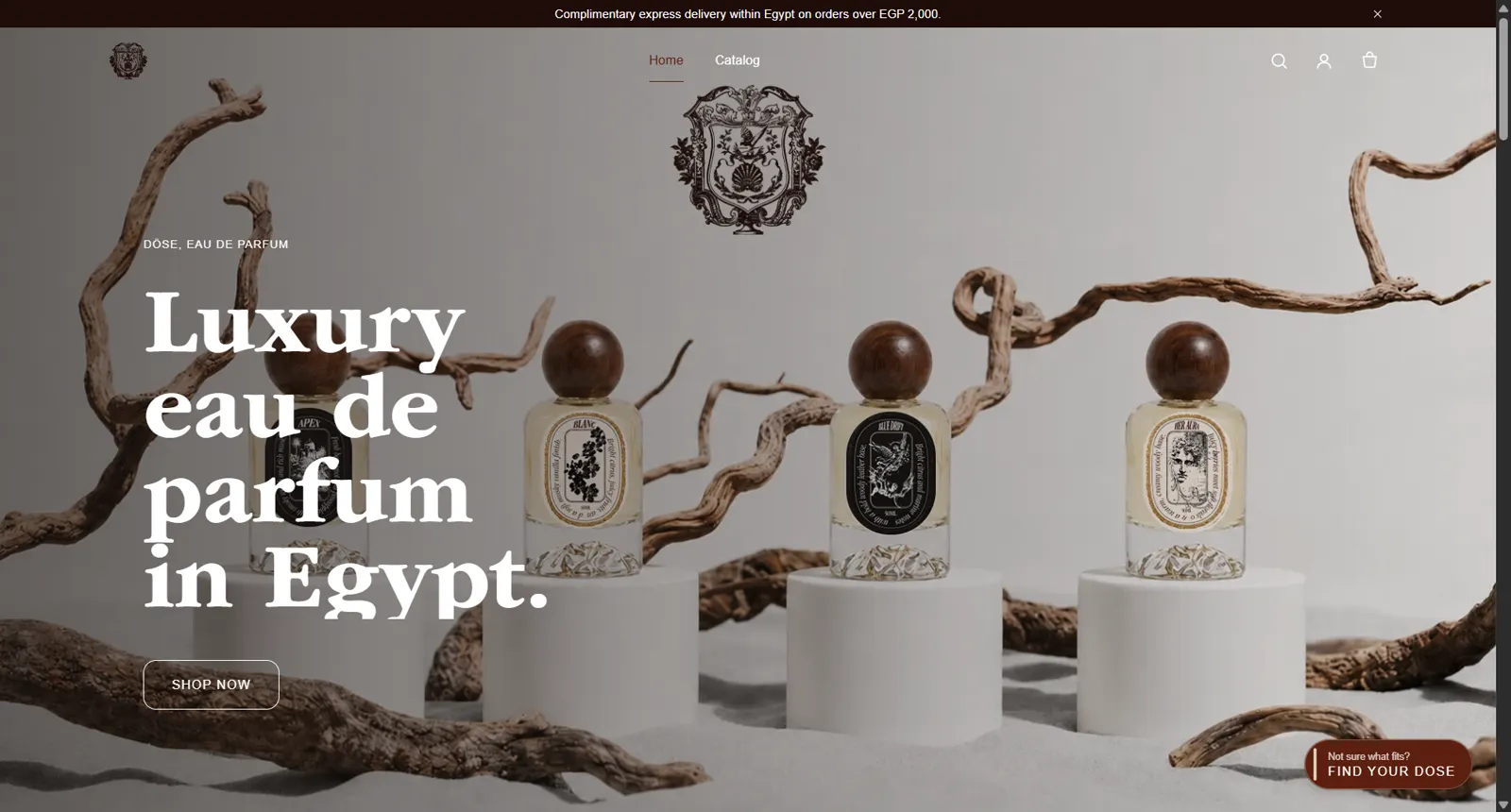
Open full screenshot: DÖSE homepage hero: luxury eau de parfum bottles staged as still life on sand with driftwood
Home — an editorial hero that treats the product as still life. “Find Your DÖSE” is always one tap away for the undecided.Shown
doseeg.com/
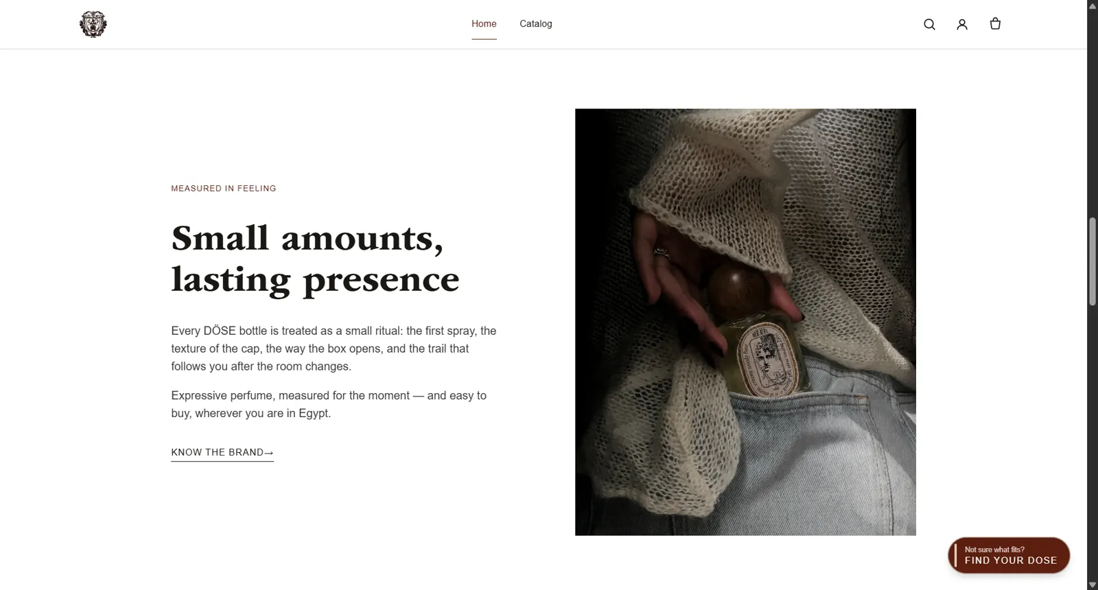
Open full screenshot: Homepage section headed 'Small amounts, lasting presence' with a moody perfume photograph
Brand story — “measured in feeling.” Scent is sold in scenes and rituals, carrying what a screen can’t.
doseeg.com/ · further down
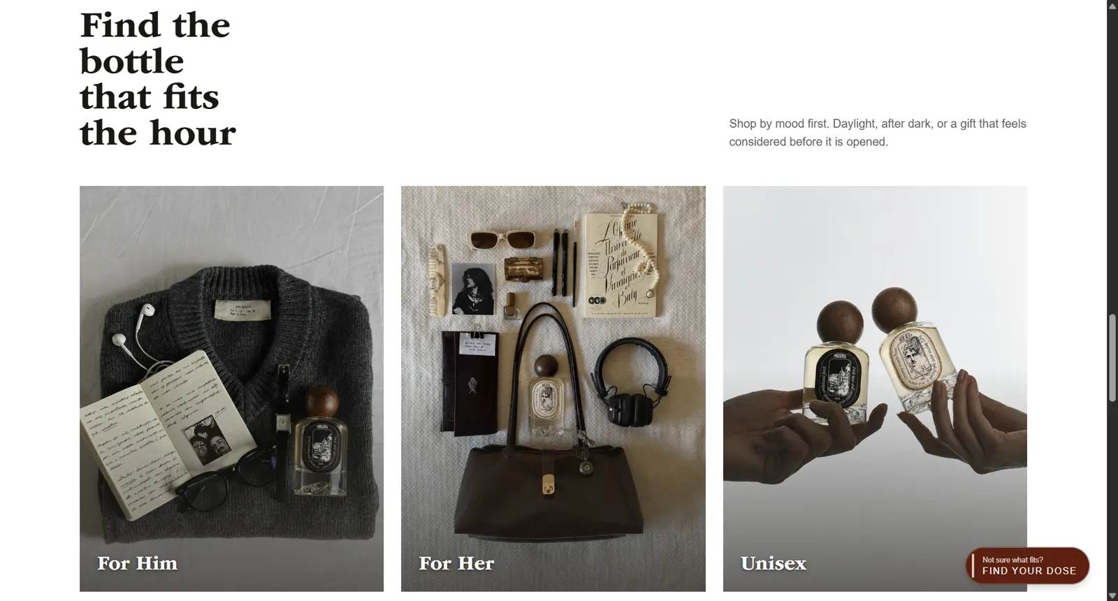
Open full screenshot: Homepage 'Find the bottle that fits the hour' section with For Him, For Her, and Unisex flat-lays
Shop by mood — “find the bottle that fits the hour.” Entry points by feeling and occasion, not just a product grid.
doseeg.com/ · further down
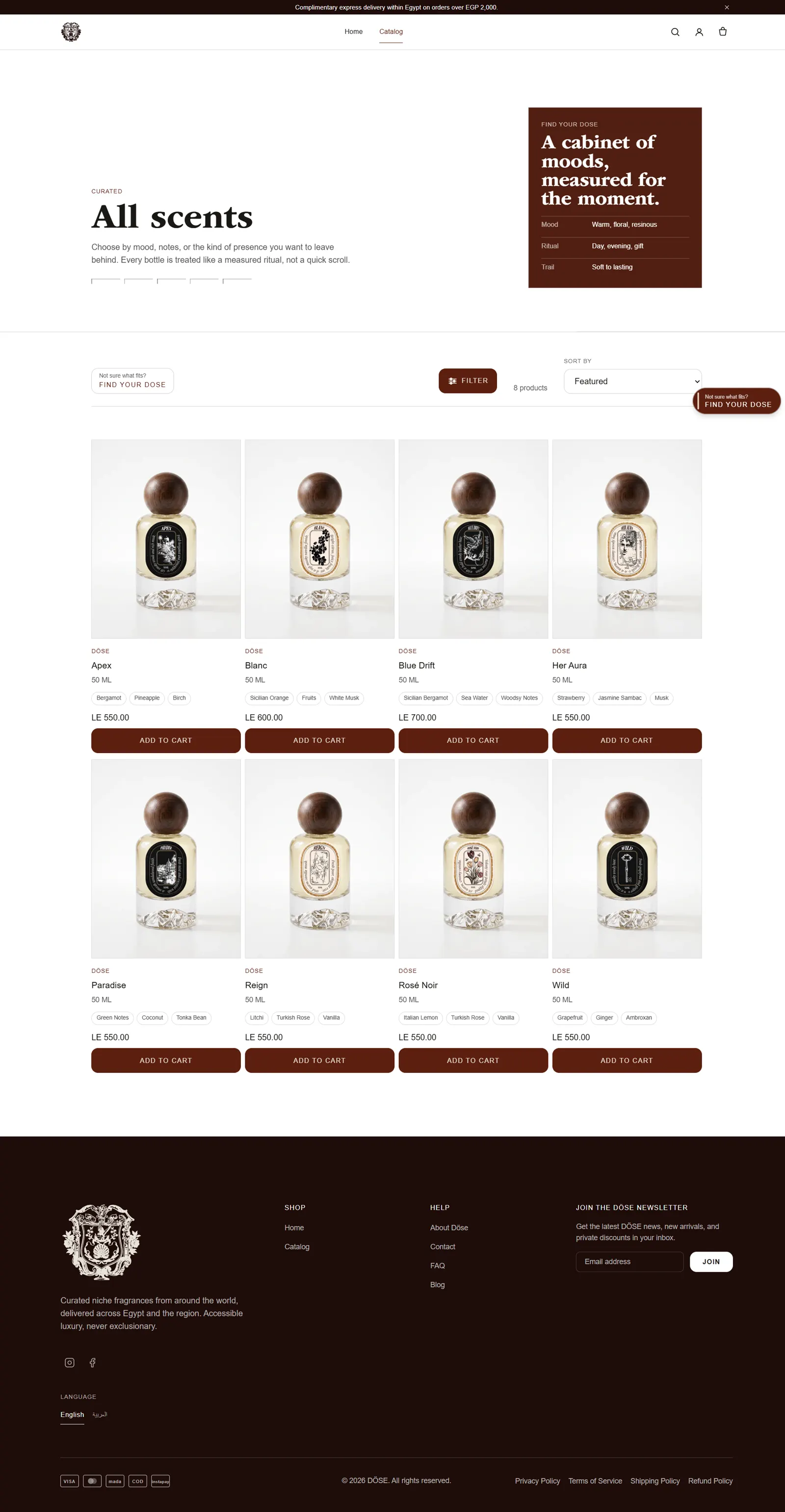
Open full screenshot: Catalog page titled 'All scents' with eight fragrances, mood filters, and a 'cabinet of moods' panel
Catalog — “a cabinet of moods.” Every bottle shows its notes and price up front, filterable by mood, notes, and presence.Shown
doseeg.com/collections/all
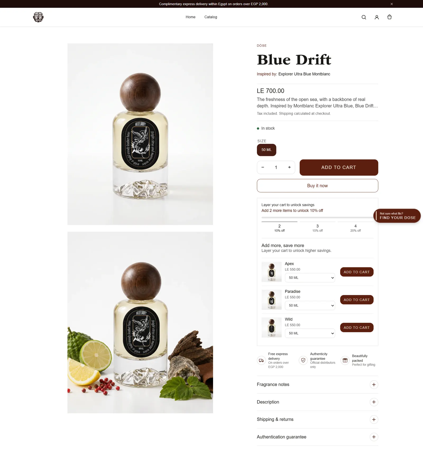
Open full screenshot: Blue Drift product page with imagery, scent description, tiered cart-savings, and cross-sell
Product page — story and imagery first, then price. Tiered “layer your cart to save” mechanics and cross-sell drive basket sizeShown; notes, shipping, and an authenticity guarantee close the trust gap.
doseeg.com/products/blue-drift

The build

البناء

Technical implementation

  • Custom Liquid theme work — sections the brand team can rearrange and edit safely from the Shopify admin.
  • Cart & discount logic — predictable price display across promotions, bundles, and codes.
  • SEO & structured data — product schema, clean metadata, and crawlable category structure so search engines understand the catalogue.Stated
  • Performance passes — image optimisation and lean scripts to keep the premium feel fast on mobile.Stated

Trade-offs

المفاضلات

Atmosphere vs. speed

Every atmospheric image and motion flourish costs milliseconds. The discipline was treating performance as part of the brand — a premium store that stutters isn’t premium.

Platform boundaries

Shopify draws hard lines around checkout. Rather than fighting the platform, the design spends its ambition where the platform is flexible — storytelling, discovery, and the cart — and keeps checkout native and trusted.

Outcome & lessons

النتيجة

Qualitative outcomes — no invented figures.

A brand-true store

The digital experience matches the ambition of the product it sells.

Guided discovery

Undecided visitors have a designed path to a confident choice instead of a bounce.Documented

Search-ready catalogue

Structured data and clean information architecture make products legible to search engines.Stated

Lesson

When customers struggle to choose, don’t add more information — add a conversation that narrows it.

E-commerce for sensory products is a writing and sequencing problem as much as a design problem. The quiz taught the broader lesson.